Fonts play a key role in your website’s design and usability. I am sure that you are tired of just using the boring typical fonts like Arial, Georgia, & Times New Roman? Well, these are good, but sometimes you need different web fonts that have more style or that will fit in with your web design. The solution is Google fonts.
Using Google Web Fonts is a great idea because the font library is packed with many different fonts that can meet just about any website needs.
Here i picked top 10 Fonts from Google fonts especially for graphics and web design purpose.
1. Inter
Inter font family carefully crafted & designed by Rasmus Andersson.

Inter features a tall x-height to aid in readability of mixed-case and lower-case text. Several OpenType features are provided as well, like contextual alternates that adjusts punctuation depending on the shape of surrounding glyphs, slashed zero for when you need to disambiguate “0” from “o”, tabular numbers, etc.
2. Inknut Antiqua
The Inknut Antiqua project is led by Claus Eggers Sørensen, a type designer based in Amsterdam.

It comes with a complement of typographical sorts and OpenType features for the purpose. The proportions of Inknut Antiqua make it well suited for low-resolution screens.
3. Rubik
Rubik is a sans serif font family with slightly rounded corners designed by Philipp Hubert and Sebastian Fischer at Hubert & Fischer as part of the Chrome Cube Lab project.
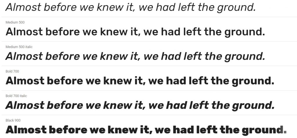
Rubik is a 5 weight family with Roman and Italic styles, that accompanies Rubik Mono One, a monospaced variation of the Black roman design.
Meir Sadan redesigned the Hebrew component in 2015. Alexei Vanyashin redesigned the Cyrillic component in 2016.
4. Roboto Slab
Roboto has a dual nature. It has a mechanical skeleton and the forms are largely geometric. At the same time, the font features friendly and open curves. While some grotesks distort their letterforms to force a rigid rhythm, Roboto doesn’t compromise, allowing letters to be settled into their natural width. This makes for a more natural reading rhythm more commonly found in humanist and serif types.

Christian Robertson designed this font. This is the Roboto Slab family, which can be used alongside the normal Roboto family and the Roboto Condensed family.
5. Montserrat
This is the normal family, and it has two sister families so far, Alternates and Subrayada. Many of the letterforms are special in the Alternates family, while ‘Subrayada’ means ‘Underlined’ in Spanish and celebrates a special style of underline that is integrated into the letterforms found in the Montserrat neighborhood.

This font is designed by Julieta Ulanovsky, Sol Matas, Juan Pablo del Peral, Jacques Le Bailly.
6. Open Sans
Open Sans is a humanist sans serif typeface designed by Steve Matteson, Type Director of Ascender Corp. This version contains the complete 897 character set, which includes the standard ISO Latin 1, Latin CE, Greek and Cyrillic character sets.

Open Sans was designed with an upright stress, open forms and a neutral, yet friendly appearance. It was optimized for print, web, and mobile interfaces, and has excellent legibility characteristics in its letterforms.
7. Lato
Lato is a sans serif typeface family started in the summer of 2010 by Warsaw-based designer Łukasz Dziedzic (“Lato” means “Summer” in Polish). In December 2010 the Lato family was published under the Open Font License by his foundry tyPoland, with support from Google.
When working on Lato, Łukasz tried to carefully balance some potentially conflicting priorities. He wanted to create a typeface that would seem quite “transparent” when used in body text but would display some original traits when used in larger sizes. He used classical proportions (particularly visible in the uppercase) to give the letterforms familiar harmony and elegance. At the same time, he created a sleek sans serif look, which makes evident the fact that Lato was designed in 2010 — even though it does not follow any current trend.
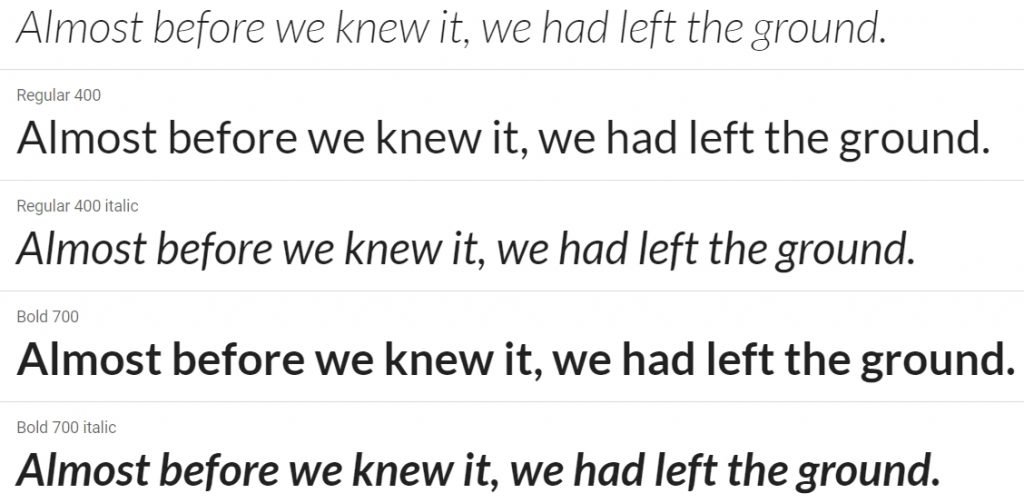
The semi-rounded details of the letters give Lato a feeling of warmth, while the strong structure provides stability and seriousness. “Male and female, serious but friendly. With the feeling of the Summer,” says Łukasz. Learn more at www.latofonts.com
8. Raleway
Raleway is an elegant sans-serif typeface family intended for headings and other large size usage. Initially designed by Matt McInerney as a single thin weight, it was expanded into a 9 weight family by Pablo Impallari and Rodrigo Fuenzalida in 2012 and iKerned by Igino Marini.
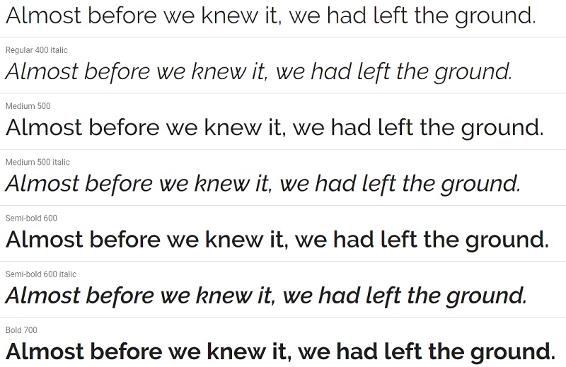
It also has a sister family, Raleway Dots.
9. Oswald
Oswald is a reworking of the classic style historically represented by the ‘Alternate Gothic’ sans serif typefaces. The characters of Oswald were initially re-drawn and reformed to better fit the pixel grid of standard digital screens. Oswald is designed to be used freely across the internet by web browsers on desktop computers, laptops and mobile devices.
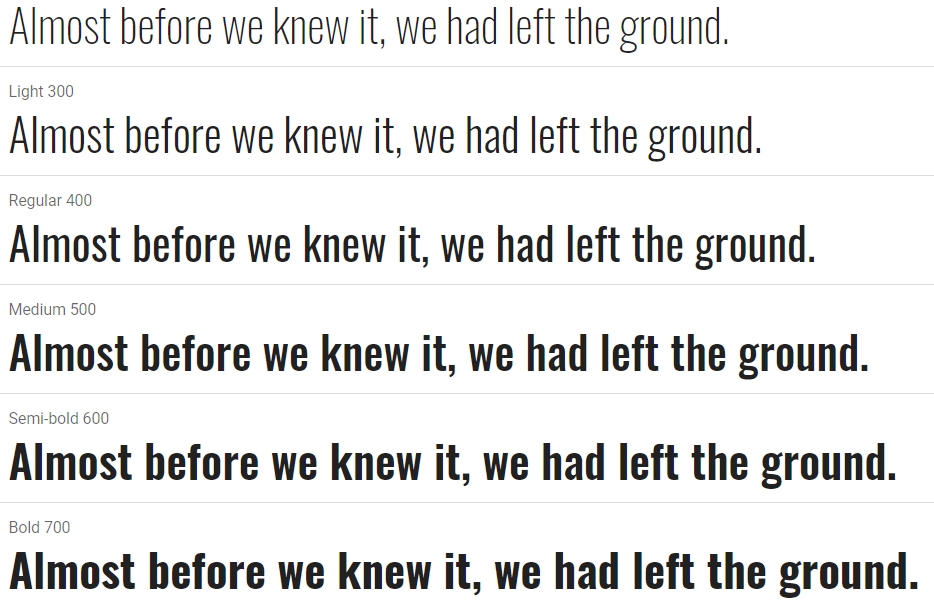
Since the initial launch in 2011, Oswald was updated continually by Vernon Adams until 2014. Vernon added Light and Bold weights, support for more Latin languages, tightened the spacing and kerning and made many glyph refinements throughout the family based on hundreds of users’ feedback. In 2016 the family was updated by Kalapi Gajjar and Alexei Vanyashin to complete the work started by Vernon, and support languages that use the Cyrillic script. In January 2019, it was updated with a variable font Weight axis. To contribute, see github.com/googlefonts/OswaldFont
10. Merriweather
Merriweather was designed to be a text face that is pleasant to read on screens. It features a very large x height, slightly condensed letterforms, a mild diagonal stress, sturdy serifs and open forms.
There is also Merriweather Sans, a sans-serif version which closely harmonizes with the weights and styles of this serif family.

The Merriweather project is led by Sorkin Type, a type design foundry based in Western Massachaussets, USA. To contribute, see github.com/EbenSorkin/Merriweather
If you liked this article, then please subscribe to our YouTube Channel for useful videos. You can also find us on Twitter and Facebook.

Write a Reply or Comment